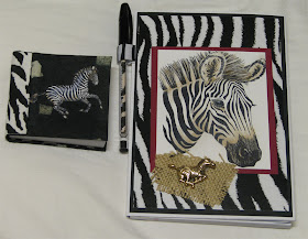
You know, these things are just too pretty to throw away after the pad is used up. So, I devised a legal pad holder that can be refilled. These are for my kitchen, so I didn't need a pen loop. They will go on our telephone table, which used to be a sewing machine table in a former life. I rescued it from a junk dealer about a million years ago when I first got married. We didn't have much money then and I was always bring home old things to repurpose. My husband got on board with the plan, and sand-blasted the wrought iron, then painted it black. My brother-in-law made a wooden table top for me and my new/old table was born. Yeah I know you see old sewing machine bases made into tables all the time now, but back then I'd never seen one made into a table. I just thought I was so clever! lol
Pages
▼
Monday, September 26, 2011
Legal Pad and Post-it book - Giraffe
Sunday, September 25, 2011
Corrections Made
Geeze, I inadvertently left out the step on how to attach the pen holder to the legal pad cover! That's what I get for working so late at night! I added it to step five below. I also added another diagram for the post-it cover and improved the directions for the spine.
Saturday, September 24, 2011
Junior Legal Pad Cover and Post-it Note Holder Revisited
I first made these in about 1998 or so. At that time we used an 8 1/2 by 11 inch sheet of cardstock for the Junior Legal pads. They had a pocket on the inside cover to keep receipts, notes etc. The cover attached to the pad on the side.
The new generation Legal Pad covers use a 12 by 12 sheet of cardstock cut down, and they come with a customized pen that coordinates with the pad cover design. I really like the addition of the pen, but I don't like the way the fold on the cover works. There is a half inch 'spine' which is too large for the side of the notebook causing a gap, and the cover kind of slides around exposing the pad. This improper fit bothers me. I know it was designed this way to create a pen holder, but why not use a ribbon for that and adjust the size for a more proper fit? This was my thought process today as I began to make some to sell at a gift shop. My design incorporates elements of the old and the new for an even better design. At least I think so:)
I also looked at the new generation Post-it Note cover and I didn't like it as well as the one I'd used in the past. To me, there is just something rather elegant about using a suede paper spine. I still like the design found in one of my many many books on making handbound books and journals. So, no changes made in that one.
Materials for Jr. Legal Pad Cover
Card stock 8 ½ by 11
Note pad
Red-liner or Wonder tape
RSVP pen
Coordinating paper for inside of RSVP pen 3 3/8" x 1"
Coordinating paper for the top of the legal pad 5” x 1”
Scoring tool
Art stamps
Ink pads and any coloring medium you like, Prismacolor pencils, Copic markers etc.
Decorative paper
Ribbon 5 inch piece of coordinating pattern
1. With the cardstock in a “portrait” position, score at 10 ½ in, 10 ¼ in, and 5 in.
2. Cut on the score line ½ inch from the bottom, and 5 inches from the left edge. Refer to the diagram.
3. Cut away a portion to give your folder a curved edge at the top on the left side. See diagram.
4. Fold the left bottom score up. Fold the left side to the right. This makes a pocket Adhere the pocket to the main cardstock using wonder tape at the bottom fold. This pocket can be used to contain receipts, stamps, envelopes etc.
5. At this point, stop and decorate, stamp and embellish the front and the inside pocket with any technique you like. First, glue or tape your design to a cardstock mat to provide support for the pen holder. Take a 5 inch piece of ribbon folded in half and secure with red liner tape to the front cover. Finally, tape the completed design over top of the ribbon.
6. Cut a strip of decorative paper to cover the top of the tablet 1 by 5 inches.
7. Fasten the pad to the first score fold with the red-liner tape. The ½ inch fastens to the card stock. The ¼ inch fold is the thickness of the pad. The front folds over and viola!!
8. Take the end off the Pentel RSVP pen and fold the 3 3/8" x 1" piece around the pen refill, then slide it into the pen. Replace the end and you have a pretty matching pen.
Post-it Pad Cover
Materials:
Part of the Book Purpose # to Cut Size
matboard front & back covers 2 3 1/8” x 3 1/8”
Decorative paper cover front & back 2 4 ½” x 4 ½”
Suede paper spine/hinge 1 2” x 4 ½”
Suede paper inner spine 1 2” x 3”
Pages Post-it pad 3” x 3”
Decorative paper endpapers 2 3” x 3”
Other Materials:
Items to decorate covers (clay images, feathers, charms, ribbon etc.)
Double stick tape, glue stick or Xyron
Scissors
1. Cover the matboard with decorative paper.
2. Place the covered boards right side down on top of the spine paper. With all wrong sides facing you, allow ½ inch in between for the Post-It pad.
3. Fold and glue spine ends to inside of cover boards. Then glue inside spine cover in place.
4. Glue the end papers into the inside of the covers.
5. Take off the backing sheet from the Post-it pad and place on the back cover board.
6. Embellish the cover with buttons, charms, shells etc.
Wednesday, September 21, 2011
Flutterby Day!
The desk in my studio faces a large picture window which gives me lots of great light and a great view of the flower beds I planted. While I simply adore flowers, I don't possess an ounce of botanical talent. My husband, however, is the "Mr. Green Jeans." So for me to have planted a couple of flower beds of perennials is a very rare occurrence indeed. This afternoon while painting, I looked out the window and saw dozens of butterflies flitting around my flowers. After about thirty minutes or so, I could not longer fight the urge to grab my camera and go outside. I don't know if you've ever tried to photography a flutterby, but it's not that easy. They really don't care about posing for you to immortalize them on film. They are more intent on drinking nectar, and they are fast too. If I were a butterfly, I'd find one flower, take a load off and rest while drinking my fill. I mean seriously, what's with this take a sip, fly away, sip from another flower, fly away and then come back to the first flower thing anyway? I'm just saying, they've got that cool narrow tube in their mouth that acts like a straw, so what's with all the flitting? I know a few things about butterflies, for instance that tube they use to drink nectar with is called a proboscis. And did you know that butterflies can taste with their feet.? They have six legs and they each have sensors on them that can tell just by landing on a flower what it taste like. Anyway, I got some pretty good shots.
The Gulf Fritillary
.
Monday, September 19, 2011
Colored Pencil Tutorial Part 2
Tutorial Part 1 (9/1/2011)
Prismacolor Charts (updated 11/15/2011)
I've been experimenting and polishing up my technique this summer. In the last couple weeks, I've been using lots of different types of paper. I really like a smooth paper the best because it is possible to build up many layers of color. This afternoon I was re-reading a back issue of Somerset Studio and came across an article on colored pencils written by Sherrill Kahn. In it, she stated that she preferred smooth papers too. It was kinda cool to see where I'd made notes in the margin 12 years earlier. I was lucky enough to learn first from my sister-in-law, Barb. She is an art teacher and a very talented artist. I hope these Techniques and Tips will help you. Check out additional info on previous posts.
Techniques
Papers
- Papers play a key role in the finished project. White is generally best.
- Texture is described by its tooth, the more tooth the rougher the texture.
- You do not want a paper with too much surface texture for good color laydown. On the other hand, a fine-grained finish can give a delicate and fine silky line, but it does have reduced color intensity.
- Experiment: even wood, canvas, pastel cloth, unglazed clay can be good surfaces for art pencils.
Selecting a Palette
- Avoid buying complete sets with colors you may never use.
- Buy open stock.
- Build palette by selecting colors from the hue families arranged around the color wheel.
Erasers
- Plastic – for light colors, smooth tooth (for smears)
- Kneaded – like putty, sketch to fit in any area (will smear a lot!)
- Handheld portable electric erasers work well to take away a bit of color, add light (I swear by them!)
- Artgum – never use – takes the ink off
Pencil Sharpener
- Never use too sharp, it makes a line
- Manual – lasts longer, cost less, gives greater control in sharpening (buy a good one like Prisma brand or Dux)
- Electric – gives a very fine point in a short time, less work
Basic Techniques
- Use light pressure, layer colors on top of each other.
- NEVER use just one color – 2 colors = 2 dimensions (2 colors + finishing off with white & black
- Pick two analogous colors (next to each other on the color wheel) some examples:
chartreuse and canary yellow red and yellow-orange red and red-violet pink and red-orange pink and yellow-orange | pink and red-violet yellow and yellow-green blue and blue-green blue and green blue and red-violet | blend: scarlet lake to raspberry to orange then yellowed orange blend: chartreuse to lime peel then olive green |
- Don’t stop too soon with applying color – the more pencil you put down on the paper, the more it will begin to smooth and blend the colors together. Once the surface or “tooth” of the paper is completely filled, the color begins to move more like paint than pencil.
- A neutral colored cardstock like a tan shade adds to the composition and provides contrast for the lighter colors of pencil that a white background can’t.
- Stamp in a brown ink rather than black (black gives an outlined and kind of cartoonish look). If you stamp in brown, you can finish off the deepest shadows in black or dark sepia and get wonderful three-dimensional effects.
- Start with the lighter colors then move to the darker (sky first)
- Use white with medium pressure on the sides of the object that faces the light.
- To create depth and texture, use a stylus to press into the paper making a groove or dent. Then when the pencil is rubbed over the top, the indented area will not collect the color and the line remains distinct. A great technique for the veins of a leaf, the whiskers of an animal etc.
Light and Shadow
· Adds illusion to your artwork – you can create realism, weight, space or height.
· Light comes from one obvious direction (sun, a lamp, etc.).
· Shadows are caused by an object blocking the light source so they fall on the opposite side the light is coming from.
Color Theory
- Use only 3-4 colors in a composition
- Analogous Complementary Scheme: Count any 3 colors moving around the outer rim of the color wheel, and then look directly across the wheel from one of those 3 colors to find its complement.
- Select orange, look directly across the color wheel – blue, next to it is blue-green, and to the left is blue-violet.
- Select red violet (magenta) then count two more colors over to the right - violet and blue violet. Now choose a complement by putting your finger on magenta and following the line directly across the wheel to yellow green.
- Triads: Three hues equally positioned on a color wheel. The colors are positioned 4 spaces apart from each other on the wheel, and are made of 2 colors from one color temperature, and 1 color from the opposite temperature.
- Red, yellow (warm colors) and blue (cool color)
- Green, violet (cool colors) and orange (warm color)
- Coloring a bush: just one shade of green w/black & white for darker or lighter places = BORING. Try blue green, yellow green, and either yellow or blue.
Color Suggestions (Prismacolor)
- grass and leaves: spring green 913 or apple green 912, and shade with olive green 911 and dark green 908
- Caucasian skin: light peach 927, and use blush pink 928 for cheeks
- wood: goldenrod 1034, and shade with burnt ochre 943
- good color for shading on white: blue slate 1024
- nice color for blonde hair: sunburst yellow 917, shaded with burnt ochre 943
- brown animals like dogs and bears: goldenrod 1034, shaded with mineral orange 1033 or burnt ochre 943 shaded with sienna brown 945
- crimson red 924 looks great shaded with scarlet lake 923
- hot pink 993 shaded with magenta 930
Other Tools and Tips
- Burnishing – layering and blending color on top of each other until the entire image is covered. Then use a white or very light color with heavy pressure to blend or burnish the colors together. You can then relayer color over the burnished area.
- When completely done, and you want a smoother finish; use a rough paper towel or a tissue to polish for a minute or two. This will give a very smooth, even texture (it won't accept more color at this point).
- You can also blend with a stiff bristle brush.
- To lighten, lift off color with masking tape – apply and burnish, then pull off.
- Pencil extenders are a must. They add length to pencil stubs that are too short and allow you to get every last bit of use out of your pencils! On one end is a wooden, pencil type of shaft, and the other end there is a metal ferrule and locking ring.
- Since they have a very soft lead, you have to treat them gently. If they were ever dropped or manhandled at some point, the lead inside can break easily. The lead inside the wood casing ends up in pieces, so when you go to use them the small pieces of lead can just fall out.
Sources:
Borgeson, Bet. (1998). Colored Pencil for the Serious Beginner. Watson-Guptill, New York.
Brethauer, Dave. (2000). Stamp in Color Techniques for Enhancing Your Artwork. Martingale & Company, Rothwell, WA.
Caiaccia, Laura. (2000). All About Color: Special Issue. The Rubber Stamper Magazine.
Gimbel, Debbie. (1999). Totally Useful Color Theory For Stampers. Inky Antics Rubber Stamps, Cleveland.
River City Rubber Works (1999). Colored Pencil Tips & Techniques For Rubber Stampers. Wichita KS: Dana DeCicco.
Sallee, Kasie. The Art of Life. http://www.theartoflifeblog.com/2007/10/prismacolor-color-chart.html August 29, 2011.
Schoenfeld, Robin. (2002, July/August). Color Theory 101. Expression, 58-66.
Saturday, September 17, 2011
Origami Kimono
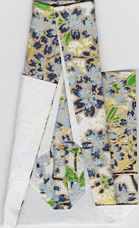
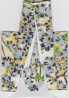
I always have such fun with origami! I know how to make a few different types of kimono folds, but this one is my favorite, so I thought I'd share it with you:) Printable copy
1. Begin with a 2 by 8 inch piece of paper. Fold a small cuff (approx. ¼ inch) at the bottom of the paper and turn over.
2. Fold right corner up to almost center. Do the same on the left. This forms the collar.
3. Fold bottom up 2 inches, then turn over.
4. Fold top down just above the crease.
5. Fold right top corner just past center diagonally. The bottom of this diagonal line fold (near the collar, is more narrow than the other end). Do the same fold on the left side.
6. Fold the top layer of the bottom right, out to lie flat. Press it down with your thumb. It’s kind of squash fold; it forms triangle. Do the same on the other side.


7. Fold the top right corner out diagonally and then repeat on the left side. These two folds make the open fold at the bottom of the finished kimono.
Friday, September 16, 2011
I love Pretty Papers!
I've been busy creating with the Japanese papers the mail lady brought this week. Here are a few of the things I made.
 |
| Tria brand alcohol inks on the kimono and the Oriental Characters. |
 | ||||||
| I even use the scraps of paper!! |
 |
| Windows into Polished Stone, technique in a previous Blog. |
 |
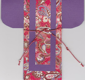
| I love origami too:) This kimono only takes a 2 by 8 inch piece of paper. I'll make cards for these tomorrow. |
Thursday, September 15, 2011
Vendor Brag
I think I'll finish up this theme tomorrow. But first, I have to make some things with my gorgeous new Japanese papers from Stone House. I love their papers, and the prices are great too:) Anne, the owner, always sends a pile of lovely scrap pieces that are almost as much fun to use as the large pieces. The papers I ordered are 8 by 12, and I use them on cards, notebook covers, in iris folding, origami - all kinds of things! Stone House is definitely my favorite place to buy papers for my Oriental creations. They also have embellishments, dies and beautiful stamps, which I happen to own several of too:) Their gallery is amazing, I love looking at the wonderful examples. I'm not affiliated, I just like to acknowledge great companies who carry first rate products and offer superb customer service:)
 |
| These are my pretty new 8 by 12 sheets of Yuzen Chiyogami. Aren't the paisleys just to die for? Ohhh I must find a paisley stamp! |
 | |||
| Aren't these scraps pretty? I love all the card layout challenges on the Oriental Stamp Art Forum. They provide lots of great ideas to use scrap pieces with. |


