- Use Copic markers or reinkers to color white ribbon.
- Use gold leafing markers to color plastic buttons this makes them into more classy-looking charms. Use embossing powder to change plastic buttons into metallic-looking charms too.
Copics work to color buttons too. - Brads, buy a bag of ordinary brass office brads. Holding the legs with tweezers, press them into a pigment ink pad, then into embossing powder, and heat. OR buy the white ones and color them with Bic Mark-its!
- Corrugated card packaging makes great textural layers
- I read about someone who made a stamp positioner of Lego bricks
- Sewing machine- cheap, but looks expensive (less adhesive). It’s easy and adds texture and interest to the cards.
- Save the mesh bags from produce to use on cards -use mini brads to attach it.
- Recycle a catalogue by tearing out the bedspread and duvet pages - use these for the faux cloisonne technique or embellishments on paper.
- Make paper beads:
- http://gomakesomething.com/ht/recycled/paper-beads/
- http://paperbeads.org/space-them-out-with-paper-beads/
- http://madmim.com/paper-bead-tutorial/

Wednesday, October 26, 2011
Make Do Instead of Buy New
Sunday, October 23, 2011
Radiant Pearls
Sadly, these wonderful paints are no longer manufactured. Angelwings Enterprises, the company that used to make them sponsored a contest several years ago. I won and received 50 jars:) I have thoroughly enjoyed using this wonderful product. Many people still have them, and have asked for info. so I'm sharing the tips I used when I used to teach classes.
- Use very little. Put what you think you want on the brush, then use about half of that. They spread and blend wonderfully and it really takes very little. They will take quite a while to dry, which makes them so wonderful to use with embossing. Because of their slow-drying capability, they can be placed on a meat tray or an old CD to make a palette. They will not dry out even if uncovered for months.
- To emboss, when you are all done painting, just dump embossing powder on them (they’re still wet remember?) and heat as usual. It will change the colors slightly.
- They will air dry on regular cardstock. They will act differently on different kids of paper. Some are drop dead gorgeous on black, so-so on white. Very absorbent papers will suck them up – harder to spread, blend and they will dry faster. They look great on rice paper, but it really dries FAST. Have fun and experiment.
Detail Painting
- Start with an image embossed with black embossing ink/black detail embossing powder (colors are optional, but this combination gives the most detail.)
- Apply with paint brush (do not mix with water). Pour the colors out onto a palette. Decide what your color range will be. Lay down your lightest color first, it could even be white (snow queen) always mask the ‘light’ (the areas where the light will be).
- Next dip your brush into the darker color you would use to shade with, and paint where the stamp is etched for indicating shading.
- Mix a little dark color in the “neutral” color family you started with. You have now blended your own pastel shade. Use this new pastel in the lighter unetched areas of the stamped image. Viola, you have created light and dark shading, and you can blend as you like.
- The thinner the application, the better. Radiant Pearls have a texture all their own. Move the ‘pearls’ in the movement of the stamp image, such as the curl of a leaf.
Stippling
Stamp and emboss the image. Use a stipple brush to pick up a small amount of Radiant Pearls then prime your brush by moving the paint around on a palette made of an old CD or meat tray. Bounce the brush onto and around the image. Move from lightest color to darkest and be sure to blend between the colors for a feathered look.
Backgrounds
There are a lot of fun and lovely ways to create backgrounds using Radiant Pearls. The key to most of them is to paint your focal image and then seal it with clear embossing powder. Once the image is sealed you can create backgrounds without fear of damaging the focal image.
- Use any kind of tool to dip and create a texture with
- Create splatters of paint on your paper
- Use a fan brush to make giant swaths of color across your paper.
Direct-to-Rubber
Use your stipple brush to pick up some paint and then put it on your palette. Prime the brush by spreading the paint around with it. Bounce the loaded brush directly onto the stamp’s rubber surface. Do not use a thick layer. Add more colors as desired. When the stamp is painted completely with blends between the colors, stamp it onto the cardstock. You can get much softer images for the background, by stamping without re-painting the stamp. Just stamp it again and again for progressively lighter images.
Bleach Techniques
Stamp and emboss your image. Use the synthetic brush (I use a water brush http://www.dickblick.com/products/niji-waterbrush/) to paint in any areas you want light, with the bleach. After it is dry, paint the image again with Radiant Pearls. *It is important to use a synthetic brush as the bleach will dissolve the bristles on a natural bristle brush. Keep your brush sitting in water when not in use, to keep the bleach from destroying the bristles. Try diluting the bleach to different strengths with water for a darker or lighter effect on the paper. Use bolder colors of Radiant Pearls than you would normally select as they will need to stand up to the color of the paper.
 | ||||
I embossed with black, then painted. I used a stipple brush to apply paints to the background.
|

 |
I got this book when I won a contest along with several jars of paint and a video. |


Wednesday, October 19, 2011
Recipes

We are huge college football fans. Go Clemson! These recipes have always been popular at our football parties.
Pizza Dip
2 pkg. Cream Cheese
1 pkg. pepperoni-cut into slices(I cut it into fourths)
1 jar pizza sauce
1 pkg shredded cheese (pizza blend)
Thaw cream cheese until soft, spread 1 pkg into bottom of casserole, top with pepperoni, pizza sauce and cheese. Repeat layers. Bake at 350 for 15-30 min. or until hot and bubbly.
Stromboli
1(16 oz.) loaf frozen bread dough – thawed
¼ lb. thinly sliced ham (I think I used more)
¼ lb. Genoa salami (I think I used more of this too, I don’t exactly measure)
½ tsp. basil – divided (maybe a bit more here too)
½ tsp. oregano – divided
3 oz. sliced provolone cheese
1 cup (4 oz.) shredded mozerella cheese (I’m pretty generous w/this too)
2 tablespoons marg. melted
1 TBsp cornmeal
Place bread dough on a lightly greased baking sheet; pat into a 15 X 10 inch rectangle. Arrange ham slices lengthwise down center; place salami on top. Sprinkle with ¼ tsp. basil and ¼ tsp. oregano. Arrange with provolone cheese over herbs, and top with mozzerella cheese; sprinkle with remaining herbs. Moisten all edges of dough with a small amount of water to seal. Bring each long edge of dough to center; press edges together securely to seal. Seal ends. Brush dough with 1 Tbsp. marg. Sprinkle with cornmeal, and carefully invert. Brush with remaining marg. Bake at 375 degrees for 25 minutes.
makes 4 large servings (I always make 2 of these)
Ingredients
2 cans (14-1/2 ounces each) pitted tart cherries
1 cup sugar
1/4 cup (heaping) quick-cooking tapioca
1 tablespoon corn starch
1 teaspoon almond extract
1/8 teaspoon salt
CRUST:
1 cup all-purpose flour
1/3 cup sugar
1/4 teaspoon salt
1/8 teaspoon baking powder
6 tablespoons butter, melted
TOPPING:
1/2 cup all-purpose flour
1/2 cup packed brown sugar
1/2 cup chopped pecans
1/3 cup quick-cooking oats
6 tablespoons cold butter, cubed
Directions
· Drain cherries, reserving 3/4 cup juice. In a large bowl, combine the cherries, sugar, tapioca, extract, salt, food coloring if desired and reserved juice; set aside for 15 minutes, stirring occasionally.
· In a small bowl, combine the crust ingredients. Press onto the bottom and 1 in. up the sides of a greased 9-in. square baking dish; set aside.
· For topping, in another small bowl, combine the flour, brown sugar, pecans and oats. Cut in butter until mixture resembles coarse crumbs.
· Stir cherry mixture the; pour into crust. Sprinkle with topping.
· Bake at 400° for 10 minutes. Reduce heat to 375°; bake 30-35 minutes longer or filling is bubbly and topping is golden brown.
Tuesday, October 18, 2011
Is Direct-To-Paper A ‘Lost Art’ So To Speak?
There’s so much decorative paper flooding the market today, and instead of being used for scrapbooking, its use has crossed over to card making and other paper arts. Don’t get me wrong, I’m not saying this is a bad thing, but I’m kind of mourning the loss of more artistic ways of decorating paper using inks, paints, and rubber stamps etc. I wonder if people who are new to paper arts like rubber art stamps even know about direct-to-paper? On that note, I offer this tutorial.
The Direct-to-Paper Technique
This technique requires the use of pigment ink. Slow drying pigment inks allow plenty of working time. Many stamp artists like Colorbox pads for this technique. They have small pads called Cat’s Eyes, and snap/slide out pads like the Option pads and Petal Points. Of course other brands of pigment ink can be used as well, but the pads should be small for the best outcome.
Begin by selecting the colors you prefer and apply pigment ink directly to cardstock by gently swirling and spreading the colors. Apply lighter colors first, then darker colors, letting one color show through or blend with the color that borders it. You can create random, or more controlled patterns. Try different hand motions, using the corner or edge of the pad like a brush. You can try sponging ink on the paper, or even apply it with a stipple brush. Make sure to blend the edges where the colors meet. Create a depth of color by layering colors, one over another. To get an even more blended ethereal look, use a sponge to smear the freshly applied ink. Various ink colors blending together and the paper color showing through, create a subtle and elegant look.
Using metallic or lighter colors on very dark paper produces a very dramatic effect. Many stamp artists use only three or four colors - experiment and decide what effect you like best. Make sure to use reinkers to keep the stamp pads generously inked or the foam on the pads will tear or come off. This technique is really fun and very relaxing.
To clean your stamp pad, gently wipe on a dry paper towel. Never use water or soap, those chemicals will not react well with the ink and will cause a fungus. (Once a lady came into the art store where I taught classes, and showed us this moldy stamp pad wanting to know what was wrong with it. Turns out, she tried to wash it!) The customer service department at Clear Snap told me that to repair a pad, apply Super Glue to the plastic base. When you do this, make sure the base is completely dry, using a paper towel. Then reattach pad.
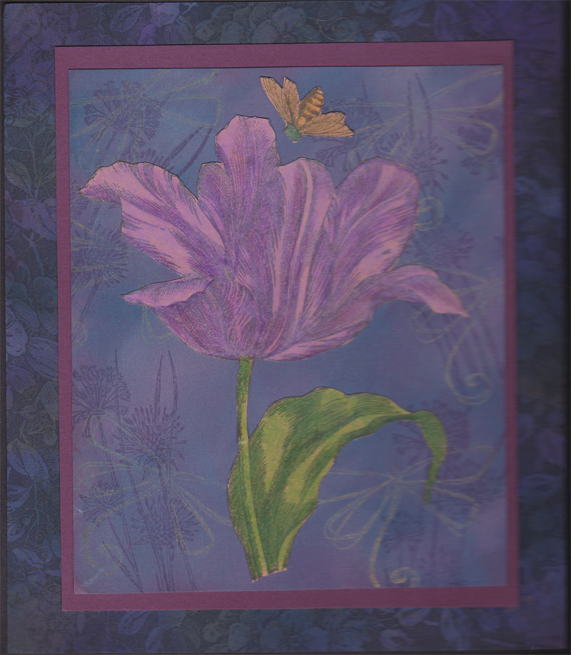
Below are some examples using direct-to-paper. Some are darker, jewel tones, but it can also be done with pastels and lighter colors with stunning results.


Below are some examples using direct-to-paper. Some are darker, jewel tones, but it can also be done with pastels and lighter colors with stunning results.


Thursday, October 13, 2011
Treasure Boxes


Materials
Cardboard jewelry box
Ruler
Pencil
Ruler
Pencil
Spray paint
Bone folder
Glue gun
Bone folder
Glue gun
Scissors
Adhesive
Matboard
Adhesive
Matboard
Self-healing cutting mat
Paper cutter
Paper cutter
Embellishments: costume jewelry, beads, feathers, ribbon, snips of fabric, sealing wax, buttons, dried leaves and twigs etc.
1. When gathering materials, choose papers and embellishments that compliment each other. For example, try selecting a theme such as Oriental, Celtic, Victorian, travel, floral, Indian, or wild animals.
2. Use only the bottom part of the jewelry box. Measure the bottom part of the box (height, width, and length). See example Figure A.
3. Spray paint the entire box - the sides and interior. Allow to dry thoroughly.
4. Measure and cut the matboards. You will need three pieces of matboard. Two identical coverboards (top & bottom) are to be cut one half inch longer than the length and one fourth inch wider than the width of the box. See Figures B and F.
5. Measure and cut the matboard spine the same width as the box is high, and as long as the coverboards. See Figures C and G.
6. Measure and cut some decorative paper. To measure accurately, place the two coverboards and spine side-by-side as in the illustration. Add one inch all around. See Figure D.
7. Apply adhesive to the back of the decorative paper and lay it adhesive side up on a flat surface.
8. Lay the spine and coverboards on top, leaving 1/16 inch space between the coverboards and each side of the spine to create hinge channels. Press the matboards down firmly so the decorated paper adheres well. Use a bone folder to press out any air bubbles. Instead of using glue, you may wish to run the decorative paper through a Xyron machine or use double-sided adhesive sheets. See Figure D.
9. Miter all four corners of the decorative paper by trimming them 1/8 inch away from the corners of the coverboards. Fold the four edges of decorative paper and glue them down. Press firmly with the bone folder.
10. Measure and cut a piece of lining paper. You can use the same paper as on the outside of the box or choose a paper with a complimentary design. The lining should measure about a quarter inch smaller all around than the joined pieces of the covered matboards. See Figure D.
11. Apply adhesive (or Xyron) to the back of the lining, then lay it adhesive-side down on the inside of the covered matboards. Be sure to use a bone folder to press the paper into the hinge channels.
12. Hot glue the painted jewelry box to the inside of the lined and covered matboards. Make sure the spine and top of the cover will lift up and over, before gluing down the jewelry box. See Figure E.
13. Next comes the fun part – decorating your box! Use old costume jewelry, leather, sea shells, feathers, barrettes, ribbon, buttons, and any other interesting embellishments. Use your imagination! Attach with hot glue.
Thursday, October 6, 2011
What is it with Fiction Series?
I'm recovering from knee replacement surgery, and have to "rest" a lot, and spend hours and hours in Physical Therapy. So my artwork has been seriously curtailed this last week. It's a good thing I love to read!
When I first began reading Janet Evanovich's Stephanie Plum series I LOVED them! I could not get enough of them, quickly buying the next one before I finished with a current book. Long about book number 15 or 16 I began to get really weary of the whole Shephanie/Ranger/Joe thing. Her character is so static, it never changes. She still just limps along barely paying her bills, and she can't choose a man. I mean what's up that? I'm so over it. I did not buy the last two books, I quit.
Then there was the Flower Shop Mysteries by Kate Collins. I really loved this series too! The characters were fun, the mystery plots were good and there was a love interest that kept me going... for a while. The 12th book comes out this fall, and I'm kinda tired of waiting around for Abby to decide to commit to her hunky boyfriend Marco.
I like dynamic characters that grow and change. Just because a character gets married doesn't have to spell the end of the series. James Patterson does it right, in my opinion. His Women's Murder Club series is one of my favorites. His characters are so dynamic, it provides another layer of interest to see how they will grow. The main character just got married in this year's installment, and it worked beautifully with the plot.
While I've been laid up with the knee, I've begun a new series, Madelyn Alt's Bewitching Mysteries. I got over the whole, 'Oh my gosh they are witches' thing and told myself they are FICTION. I enjoyed the first two, but again, this main character is so.... stuck! ahhhh
Note to authors: Let your characters change and grow like all people do, it adds more interest to your books!
Wednesday, October 5, 2011
Prismacolor Pencil charts
Prisma Colored Pencil Chart -Color Families
Numerical order page 1
Numerical order page 2
I've looked at several charts done by other artists and friends, and everyone of them has had a mistake: a couple colors left off, named incorrectly etc. I began with the color wheel chart from Prismacolor. It's done in a color wheel idea, but... they didn't leave enough space to color. This is very important, because you need to look at your chart as you're working to see what colors look like. I made one list in numerical order a few years ago, to use as my inventory sheet. The one put in color families/color wheel order is the one I use while I'm working. I hope these are helpful to you.
I intended to write a bit about my knee replacement surgery, but I've been sitting up for quite a while and I've run out of gas. I have to save energy for physical therapy this afternoon.
Subscribe to:
Posts (Atom)