background

Thursday, December 8, 2011

Trip to Ireland

I have been wanting to go to Ireland ever since I can remember. I was finally able to go last year with my son. We had such a wonderful time!!  We began in Dublin, then traveled west to Kilkenny, Waterford, Killarney, Limerick, Galway, and finally to Tullamore and Kingscourt. My favorite place was the Ring of Kerry it was soooo beautiful. The Cliffs of Moher were also pretty amazing. We saw puffins on a tiny island right off the cliffs.
Cabra Castle in Kingscourt - we stayed here and wow! It was so cool staying in a real castle!!

Jaunting Cart in Killarney, we had the most fun riding one through the Nat. Forest.
Killarney- while riding in a jaunting cart, I saw this dog walking his man.
Cabra Castle in Kingscourt
Cliffs of Moher
Cliffs of Moher
Cliffs of Moher - Visitor's Center
 
Killarney

My Studio Smells Like...

Babies!

No cute little smiles or messy diapers here.

Dina Kowal, from Split Coast Stampers has converted me to the use of baby oil as a blending agent with Prismacolor Pencils. Aside from the fact that I LOVE the smell, it blends so beautifully - it ends up looking so un-pencil-like.  It almost looks as though you've used markers. I'm still experimenting with different techniques like a very light yellow or pink for additional highlights instead of white. I find that after applying several colors then blending with my stump and baby oil, that I can still go back and add more color highlights here and there.

So far, I still prefer using a kleenex as a final burnishing/buffing tool. I tried baby wipes but they took away a lot of color and the paper got too wet.

Monday, December 5, 2011

Christmas

I've been working on several things the last few days.  I'm still decorating the last few pages of my card minder (previous post), had 2 more Christmas cards to make, a new size calendar, playing with my new stamps from Flourishes and updating my charts with new Prisma colors that came from Dick Blick. Whew.  I really wish I'd stay on ONE thing and finish it, but I'm so excited about these projects I just keep hopping from one to the other. I did finish this card.
I wanted a calendar that I could write a appointments on, but not a full size calendar (8 1/2 X 11). Since I couldn't find a template like I had in mind, I made my own on Microsoft Word. I haven't decorated it yet, but here is a picture of the layout.

 
This design fits on a half sheet of paper (8 1/2 by 5 1/2) and there is room for illustration on the side. I bound it using my spiral binding machine. Now I need to figure out some sort of cardboard stand so it will stay upright. If you are interested in this template, I'd be glad to share. Click Here

Friday, December 2, 2011

New Rubber Stamps!

Our postal carrier is the sweetest lady, especially when she brings packages of art supplies!!  Yesterday I received my first order from Flourishes and wow! I really like the images and the stamps are so well etched. I love the way all the images in the set can go together to make a scene. I know, it's not a new idea, but it is new for me.  I haven't bought any rubber stamps in quite a while, and I only have a handful of unmounted stamps. Those that I do have, don't really make a set like this.  I've had the most fun playing with them today. Here's the first completed card.
I made myself stop, so that I could address and stamp envelopes for Christmas cards. Then the dogs wanted to walk me, and there's that pesky think called dinner that had to made.

Tomorrow I'm going to a craft show with a friend, and I hope to get some inspiration as well a couple of Christmas gifts.

Wednesday, November 23, 2011

Did She Say Baby Wipes?

Yeppers! I just read this great tutorial on Flourishes website. Joan Bardee, the author of the the tutorial, says, "My trick is to use a baby wipe on the pencils. I use a store brand called Baby Basics — “alcohol free”. Just take a wipe and softly run it over the area that you want to blend."  I can not wait to try this. As a matter of fact, I'm going to play just as soon as I get done blogging:)

I've got to tell you, I am now one of Flourishes newest fans. I am soooo in love with their images and can't wait to place an order. The only problem is choosing... I want them ALL! If you are not familar with them, you've got to check out their images, and lots of other products as well. Gee, they even have me rethinking my stance about not getting a die cut machine. Yes, you heard me correctly. Me - who swore she would never ever invest all that money in a machine and all the dies.  I'm just thinking about it though. lol   So which images am I considering for my first purchase? Wanna see? I actually have it narrowed to only eight sets of florals giggles:)
  • Gerber Daisys
  • Humming Along
  • Hello Hyacinth
  • Lenten Rose (Grandma used to just love these)
  • Fuchsias in Bloom
  • Lilacs (ohh I remember these growing up in Indiana)
  • Spring Bouquet
  • Sunflowers
  • Poppy Patch
How am I going to choose?????

Tuesday, November 22, 2011

Dog Tales

It’s been eight weeks since my knee replacement and no more cane for me. I did all my errands today without it, AND I am down to one day week for Physical Therapy. I do still carry it when I walk though.

You see I am owned by two Australian Shepherds, Sidney and Cricket. When Cricket came to live with us, Sidney was immediately jealous of the new puppy. So, I told her that the puppy was hers and she had to take care of it. I did this repeatedly, and of course she understood since she is the smartest dog on earth. (Seriously, Lassie has nothing on this dog.)  As a result, Cricket has grown up thinking she is Sydney’s dog. She will not make a move until she looks at Sydney and gets her approval. She NEVER goes anywhere without her. Sydney has trained her puppy very well. In fact so well that I had not been able to get Cricket to go for walks with me unless Sydney comes too. Which is now rather difficult, because age is slowing her down quite a bit (she’s 14).
Cricket on the left, and Sydney on the right.


In the last three weeks I finally got Cricket to leave Sidney and walk with me... as long as I keep her occupied.  I talk to her, and then when I run out of things to say I sing to her.  She really likes it. You can tell because she perks her ears up and looks all happy and she smiles at me. Initially, I tried to play fetch with her too. Cricket however, had no inclination what so ever to bring a stick back or to even pick it up half the time either. She just loves to run flat out and 'chase' the stick. She absolutely loves it, so that has become part of our ritual too.  Sidney lays over under a tree on the edge of the field and stands up to get a pet when I walk by. Oh, why do I carry the cane? Well, Cricket being the dilligent Australian Shepherd that she is, tries to herd me and in doing so, she runs close to my feet and runs into me. So I carry the can in the wrong hand at an angle for protection. It's really a rather ingenious plan actually. She runs into the cane instead of tripping me. This is very important, because my doctor told me not to fall down!

You ought to see Cricket climb stairs with me. I use the longer set of stairs on the deck. At first she wanted to climb them up and down with me. Since THAT'S not safe, I taught her to wait for me at the top. Of course she is impatient and wants to be with me constantly, so she now runs down the other set of stairs and meets me at the bottom. I pet her, then I walk back my stairs and she runs up hers, and meets me at the top for another pet.  Sidney just waits at the bottom for her pets, as she’s not up to all that running around.

Cricket loves all the extra time I spend with her while I'm exercising and I do as well. I've learned she is really a smart dog too... in her own way.  She has learned several new words like "play chase the stick," and "climb the stairs.”  She also knows the difference between, "go for a walk" and "go get the mail." She takes off running in the right direction when I tell her where we’re going.
Sydney

Sunday, November 20, 2011

Card Minder Book

I learned of this design from Jeanne on Split Coast Stampers, and thought it was such a beautiful design. I thought I was clever because I typed up a list of birthdays and other card-giving occasions, but this is genius! With a pocket to hold cards for each month, it will make getting them mailed out on time easier. I've had such fun making this and decorating the pages.  I've tried really hard to do a clean and simple look, which is very hard for me.
January pocket page and list for the month.


I did the list pages for each month on a Word document with a calligraphy font. Here are the documents: 

Friday, November 18, 2011

Playing Around With Scraps

Bargello is on my mind.... and there is this box of scraps cut into strips staring at me from the shelf. So I made something. These are jewel tones, the colors that were so popular several years ago. Magenta made such dramatic things with these colors. But while preparing the tutorial (previous post) I really fell in love with the lighter, brighter colors they've used more recently. They just make me happy! I adore the things found in this book: Link Here

Thursday, November 17, 2011

I'm Back in my Studio

Recovering from knee replacement and my only child moving clear across the country has been kind of depressing. I’ve spent most of the last two weeks holed up in the kitchen. I’ve been trying new recipes like crazy. I'm surprised I haven't gained any weight! I think I better quit while I'm ahead! Yesterday I took a bunch of things from my stash to a gift shop (on consignment). This seriously depleted my inventory so today I am back in my studio working away. However, I'm walking every day, doing my exercises and climbing stairs (up to 16 times).

Ohhhh and I read the BEST book! "The Cinderella Deal" by Jennifer Cruise. It's a love story, but not one of those sappy romances where the plot is soooo predictable. It's very well written, and the characters are so well defined.  I thoroughly enjoyed reading it and “getting to know the characters.” This is so not like me – I usually read non-fiction or mysteries. The mystery I read last week was by an author that I like, but it really scared the pajeebers out of me. Now, I admit to being a total wuss. I hate scary movies, why even Jurassic Park scared me silly. You know the part where the Tyrannosaurus Rex eats the guy and you can hear it crunching him up? Well, that gave me nightmares! I guess being sad lately has made me more sensitive. So, I’m going to lay off the mysteries for a while.

Wednesday, November 16, 2011

One of the Prettiest Paper Art Techniques!

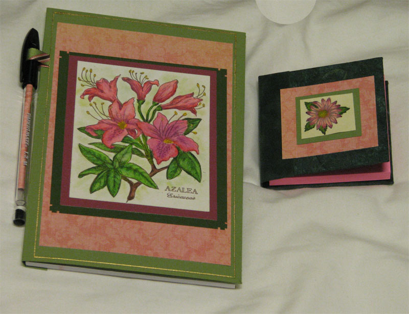
I know many of you have heard of the Bargello technique. I saw a tutorial recently that used decorative paper. For some people use of decorative paper is a perfect fit. However, I love the artistic element involved in Magenta's method.

Paper Quilting
Also Known as: Bargello – Magenta Style

The Bargello is a needlepoint stitch with a zigzag pattern used in 17th century upholstery. Today, this technique is used by quilters who create breathtaking works of art. http://www.bargelloarts.com/?page=25

Several years ago, Hélène Métivier, co-owner of Magenta rubber art stamps, was given a book about Bargello quilts and she adapted the textile form to paper. Her works are spectacular wall hangings, but you can produce them in card-size works of art too. http://bellacartaatartnsoul.blogspot.com/2011/09/from-montreal-quebec.html

Directions
Materials
smooth cardstock in different colors that are compatible – cut 1 inch by 5 inches
STRONG adhesive, double-stick tape of Xyron
Paper cutter
Several art stamps (at least one should be a fine-lined image like Magenta’s stylized dragonfly)
cardstock
black dye ink
pigment ink in several colors for direct-to-paper coloring
Metallic pigment ink like Encore

1.      This card consists of 4 layers. The card itself, one layer of plain cardstock, the Bargello layer, then an embossed cut out image on top. Sizes may vary according to your desire.

2.      Cut various colors of cardstock into several strips 1/8 to 5/8 inch wide. You will need 2-3 different widths to make your design interesting. Make sure you are cutting perfectly straight, and that the paper is lined up perfectly straight on the cutter. Even a tiny bit of deviance will show up later on. A paper cutter makes this so easy. I save scraps from cards and cut them into strips.

3.      Use the direct-to-paper technique to provide a background for each strip. Use 3-4 colors of pigment ink pads. I use Clearsnap’s Cat’s Eye pads. Lightly rub the ink on each strip, beginning with the lightest colors then progressing to the darkest color.

4.      After you have several strips done in this manor, stamp on them with black dye ink. Choose an image that is fairly dark, or solid. If the stamp is larger than the strip, just try to stamp with the same part of the stamp each time. Try not to use more than 2 stamps on each strip.
5.      Overstamp with a metallic pigment ink (I like Encore gold). Choose an image that is fairly open or “lacy” for this. Again, if the stamp is larger than the strip, just try to stamp with the same part of the stamp each time for a uniform look. Don’t worry about each strip looks when it’s finished because  you will be cutting it up and putting it back together again anyway.

6.      Cut a piece of black cardstock to the size you would like the top layer of your card to be. Then cover one side of it completely with adhesive in any of the following ways:
·       Glue with a good glue
·       apply a sheet of double sided adhesive
·       use a double-sided tape dispenser to apply adhesive
·       use a Xyron machine

7.      Begin by laying the first strip across one edge of the black cardstock. Lay the next strip right next to the first one, without leaving any space between them. You can alternate the direction of the strips if you like. Place a couple strips horizontally and a couple strips vertically, repeating until the cardstock is completely filled. You could also lay the strips in a diagonal pattern. In this case begin in the middle, placing the first strip from corner to corner. Or you can lay 3-4 strips in a horizontal direction. Then lay 3-4 in a vertical direction just under those. Finish by placing the last strips in a horizontal direction again.

8.      You will have strips that extend beyond the black cardstock. Trim the edges of the strips even with the black piece.

9.      Use a gold/silver leafing pen like Krylon, to line the edges of your Bargello piece. Just place the tip half on the edge, and half off. Go slow and you will have a beautiful gold edge.

10.    On the card itself, or the bottom layer, stamp with black and overstamp with gold just like you did the strips. You only need to do the outer edges of the card, as the center will be covered up with the other layers anyway.

11.    Attach the layers with double-stick tape. Finally, using a piece of cardstock (a color of one of the layers) stamp and gold emboss a flower, butterfly or some other image is relatively solid or “filled in.” Cut it out close to the embossed edge, and carefully the edges with the curved handle of your scissors. Now attach it to the Bargello layer using raised mounting tape.


Here are the directions for the traditional Bargello pattern:

1.    Cut your cardstock into a variety of widths, color using direct-to-paper technique, then stamp images onto cardstock in black, and finally overstamp in metallic ink.

2.    Cut a piece of black cardstock to the size you would like the top layer of your card to be. Then cover one side of it completely with adhesive in any of the following ways:
·       Glue with a good glue
·       apply a sheet of double sided adhesive
·       use a double-sided tape dispenser to apply adhesive
·       use a Xyron machine

3.    Begin by laying the first strip across one edge of the black cardstock. Lay the next strip right next to the first one, without leaving any space between them. Trim edges that are hanging over.

4.    When the glue is completely dry, the next step is to cut your project apart AGAIN. Turn your cardstock so the strips are horizontal, and using a paper cutter or an exacto knife, cut strips into various widths. (ex. 1/4", 1/2", 1", 1 1/2"). As you cut each strip, move it to the side being sure to place each strip you cut right next to the one before it. In other words, you want to keep all the strips in order.

5.      After all of the strips are cut, get out another piece of black card stock. Begin by laying out your strips in order varying the heights of each strip. Make mountains and valleys going up and down, lining up your colors so that you never move up or down more than one colored segment at a time. If you stand back and look at your design, it will look liked curves. The thinner yours strips, the more pronounced the curve will appear.
6.      Lay out your design and cut the bottoms of each strip off and then glue it to the top of that strip so that you keep a rectangle shape.

7.      Glue your finished product to a complementary color card stock.

Tuesday, November 15, 2011

New Prisma Colors Added to Charts

 I just spent tons of time last month organizing my notes, typing them, and devising a numerical chart and a color family chart with all the correct colors. This took hours cross referencing various lists because the people who made them, had errors. Then I  get an email from Prismacolor announcing that they just added 18 new colors! lol:) So... I redid my charts:
Organized by color families (color wheel) to fill in with the pencils you have. It's a great help to use while using  your pencils.
Color Family Chart  (updated 12/16/2011) all one page
Numerical Order Chart page 1
Numerical Order Chart page 2 
Color Pencil Tutorials: 
Part 1 (9/1/2011)
Part 2 (9/19/2011)

Thursday, November 10, 2011

Cooking Therapy

I've been AWOL from this blog because my only child took a job half way across the country. I was profoundly depressed at first, now just very lonely. So I've been cooking this week.
Tried the best new recipe tonight. Found it in Taste of Home magazine. In case y’all are interested, I found it online too: http://www.tasteofhome.com/Recipes/Bacon-Swiss-Penne
(I left out the peas, cause I think they are yucky)

Made this when friends came over to watch football, and it was a hit.
Pumpkin Crisp Dessert

1 can pumpkin (15-16 oz.)
4 eggs
1 can evaporated milk (12 oz.)
1 ½ cups sugar
1 tsp. cinnamon
1 tsp. ginger
½ tsp nutmeg
½ tsp. salt
TOPPING:
     1 box yellow cake mix
     1 cup melted margarine (2 sticks)
     1 cup chopped pecans

Mix all together and pour into a 9 X 13 pan that has been sprayed with Pam. Mix topping ingredients and sprinkle evenly over pumpkin mix, then drizzle on nuts. Bake at 350º for one hour. Cool to warm temperature before cutting. Serve with Cool Whip or vanilla ice cream.


Wednesday, October 26, 2011

Make Do Instead of Buy New

  • Use Copic markers or reinkers to color white ribbon.
  • Use gold leafing markers to color plastic buttons this makes them into more classy-looking charms. Use embossing powder to change plastic buttons into metallic-looking charms too.
    Copics work to color buttons too.
  • Brads, buy a bag of ordinary brass office brads. Holding the legs with tweezers, press them into a pigment ink pad, then into embossing powder, and heat. OR buy the white ones and color them with Bic Mark-its!
  • Corrugated card packaging makes great textural layers
  • I read about someone who made a stamp positioner of Lego bricks
  • Sewing machine- cheap, but looks expensive (less adhesive). It’s easy and adds texture and interest to the cards.
  • Save the mesh bags from produce to use on cards -use mini brads to attach it.
  • Recycle a catalogue by tearing out the bedspread and duvet pages - use these for the faux cloisonne technique or embellishments on paper.
  • Make paper beads: 
  •  http://gomakesomething.com/ht/recycled/paper-beads/                     
  • http://paperbeads.org/space-them-out-with-paper-beads/                      
  • http://madmim.com/paper-bead-tutorial/

Sunday, October 23, 2011

Radiant Pearls

Sadly, these wonderful paints are no longer manufactured. Angelwings Enterprises, the company that used to make them sponsored a contest several years ago.  I won and received 50 jars:)  I have thoroughly enjoyed using this wonderful product. Many people still have them, and have asked for info. so I'm sharing the tips I used when I used to teach classes.

  • Use very little. Put what you think you want on the brush, then use about half of that. They spread and blend wonderfully and it really takes very little. They will take quite a while to dry, which makes them so wonderful to use with embossing.  Because of their slow-drying capability, they can be placed on a meat tray or an old CD to make a palette. They will not dry out even if uncovered for months.
  • To emboss, when you are all done painting, just dump embossing powder on them (they’re still wet remember?) and heat as usual. It will change the colors slightly.
  • They will air dry on regular cardstock. They will act differently on different kids of paper. Some are drop dead gorgeous on black, so-so on white. Very absorbent papers will suck them up – harder to spread, blend and they will dry faster. They look great on rice paper, but it really dries FAST. Have fun and experiment.

Detail Painting
  1. Start with an image embossed with black embossing ink/black detail embossing powder (colors are optional, but this combination gives the most detail.)
  2. Apply with paint brush (do not mix with water). Pour the colors out onto a palette. Decide what your color range will be. Lay down your lightest color first, it could even be white (snow queen) always mask the ‘light’ (the areas where the light will be).
  3. Next dip your brush into the darker color you would use to shade with, and paint where the stamp is etched for indicating shading.
  4. Mix a little dark color in the “neutral” color family you started with. You have now blended your own pastel shade. Use this new pastel in the lighter unetched areas of the stamped image. Viola, you have created light and dark shading, and you can blend as you like.
  5. The thinner the application, the better. Radiant Pearls have a texture all their own. Move the ‘pearls’ in the movement of the stamp image, such as the curl of a leaf.

Stippling
Stamp and emboss the image. Use a stipple brush to pick up a small amount of Radiant Pearls then prime your brush by moving the paint around on a palette made of an old CD or meat tray. Bounce the brush onto and around the image. Move from lightest color to darkest and be sure to blend between the colors for a feathered look.

Backgrounds
There are a lot of fun and lovely ways to create backgrounds using Radiant Pearls. The key to most of them is to paint your focal image and then seal it with clear embossing powder. Once the image is sealed you can create backgrounds without fear of damaging the focal image.
  • Use any kind of tool to dip and create a texture with
  • Create splatters of paint on your paper
  • Use a fan brush to make giant swaths of color across your paper.

Direct-to-Rubber
Use your stipple brush to pick up some paint and then put it on your palette. Prime the brush by spreading the paint around with it. Bounce the loaded brush directly onto the stamp’s rubber surface. Do not use a thick layer. Add more colors as desired. When the stamp is painted completely with blends between the colors, stamp it onto the cardstock. You can get much softer images for the background, by stamping without re-painting the stamp. Just stamp it again and again for progressively lighter images.

Bleach Techniques
Stamp and emboss your image. Use the synthetic brush (I use a water brush http://www.dickblick.com/products/niji-waterbrush/) to paint in any areas you want light, with the bleach. After it is dry, paint the image again with Radiant Pearls. *It is important to use a synthetic brush as the bleach will dissolve the bristles on a natural bristle brush. Keep your brush sitting in water when not in use, to keep the bleach from destroying the bristles. Try diluting the bleach to different strengths with water for a darker or lighter effect on the paper. Use bolder colors of Radiant Pearls than you would normally select as they will need to stand up to the color of the paper.
I embossed with black, then painted. I used a stipple brush to apply paints to the background.
I just painted away... such pretty colors!


I got this book when I won a contest along with several jars of paint and a video.
This picture is inside the book.

More Desk Accessories

Directions are on a previous Blog post.


Wednesday, October 19, 2011

Recipes


We are huge college football fans. Go Clemson! These recipes have always been popular at our football parties.

Pizza Dip

Ingredients:

2 pkg. Cream Cheese
1 pkg. pepperoni-cut into slices(I cut it into fourths)
1 jar pizza sauce
1 pkg shredded cheese (pizza blend)

Thaw cream cheese until soft, spread 1 pkg into bottom of casserole, top with pepperoni, pizza sauce and cheese.  Repeat layers.  Bake at 350 for 15-30 min. or until hot and bubbly.


Stromboli

1(16 oz.) loaf frozen bread dough – thawed
¼ lb. thinly sliced ham (I think I used more)
¼ lb. Genoa salami  (I think I used more of this too, I don’t exactly measure)
½ tsp. basil – divided (maybe a bit more here too)
½ tsp. oregano – divided
3 oz. sliced provolone cheese
1 cup (4 oz.) shredded mozerella cheese (I’m pretty generous w/this too)
2 tablespoons marg. melted
1 TBsp cornmeal

Place bread dough on a lightly greased baking sheet; pat into a 15 X 10 inch rectangle.  Arrange ham slices lengthwise down center; place salami on top.  Sprinkle with ¼ tsp. basil and ¼ tsp. oregano.  Arrange with provolone cheese over herbs, and top with mozzerella cheese; sprinkle with remaining herbs.  Moisten all edges of dough with a small amount of water to seal.  Bring each long edge of dough to center; press edges together securely to seal.  Seal ends.  Brush dough with 1 Tbsp. marg.  Sprinkle with cornmeal, and carefully invert.  Brush with remaining marg.  Bake at 375 degrees for 25 minutes.

makes 4 large servings (I always make 2 of these)


Cherry Nut Crisp

Ingredients
2 cans (14-1/2 ounces each) pitted tart cherries
1 cup sugar
1/4 cup (heaping) quick-cooking tapioca
1 tablespoon corn starch
1 teaspoon almond extract
1/8 teaspoon salt
CRUST:
1 cup all-purpose flour
1/3 cup sugar
1/4 teaspoon salt
1/8 teaspoon baking powder
6 tablespoons butter, melted

TOPPING:
1/2 cup all-purpose flour
1/2 cup packed brown sugar
1/2 cup chopped pecans
1/3 cup quick-cooking oats
6 tablespoons cold butter, cubed
Directions
·       Drain cherries, reserving 3/4 cup juice. In a large bowl, combine the cherries, sugar, tapioca, extract, salt, food coloring if desired and reserved juice; set aside for 15 minutes, stirring occasionally.
·       In a small bowl, combine the crust ingredients. Press onto the bottom and 1 in. up the sides of a greased 9-in. square baking dish; set aside.
·       For topping, in another small bowl, combine the flour, brown sugar, pecans and oats. Cut in butter until mixture resembles coarse crumbs.
·       Stir cherry mixture the; pour into crust. Sprinkle with topping.
·       Bake at 400° for 10 minutes. Reduce heat to 375°; bake 30-35 minutes longer or filling is bubbly and topping is golden brown.


Tuesday, October 18, 2011

Is Direct-To-Paper A ‘Lost Art’ So To Speak?

There’s so much decorative paper flooding the market today, and instead of being used for scrapbooking, its use has crossed over to card making and other paper arts. Don’t get me wrong, I’m not saying this is a bad thing, but I’m kind of mourning the loss of more artistic ways of decorating paper using inks, paints, and rubber stamps etc. I wonder if people who are new to paper arts like rubber art stamps even know about direct-to-paper?  On that note, I offer this tutorial.
The Direct-to-Paper Technique
This technique requires the use of pigment ink. Slow drying pigment inks allow plenty of working time. Many stamp artists like Colorbox pads for this technique. They have small pads called Cat’s Eyes, and snap/slide out pads like the Option pads and Petal Points. Of course other brands of pigment ink can be used as well, but the pads should be small for the best outcome.  

Begin by selecting the colors you prefer and apply pigment ink directly to cardstock by gently swirling and spreading the colors. Apply lighter colors first, then darker colors, letting one color show through or blend with the color that borders it. You can create random, or more controlled patterns. Try different hand motions, using the corner or edge of the pad like a brush. You can try sponging ink on the paper, or even apply it with a stipple brush. Make sure to blend the edges where the colors meet. Create a depth of color by layering colors, one over another. To get an even more blended ethereal look, use a sponge to smear the freshly applied ink. Various ink colors blending together and the paper color showing through, create a subtle and elegant look

Using metallic or lighter colors on very dark paper produces a very dramatic effect. Many stamp artists use only three or four colors - experiment and decide what effect you like best. Make sure to use reinkers to keep the stamp pads generously inked or the foam on the pads will tear or come off. This technique is really fun and very relaxing.

To clean your stamp pad, gently wipe on a dry paper towel. Never use water or soap, those chemicals will not react well with the ink and will cause a fungus. (Once a lady came into the art store where I taught classes, and showed us this moldy stamp pad wanting to know what was wrong with it. Turns out, she tried to wash it!) The customer service department at Clear Snap told me that to repair a pad, apply Super Glue to the plastic base. When you do this, make sure the base is completely dry, using a paper towel. Then reattach pad.

Below are some examples using direct-to-paper. Some are darker, jewel tones, but it can also be done with pastels and lighter colors with stunning results.


Thursday, October 13, 2011

Treasure Boxes


Materials
Cardboard jewelry box                    
Ruler                                    
Pencil                         
Spray paint                                       
Bone folder                         
Glue gun
Scissors                                            
Adhesive                              
Matboard
Self-healing cutting mat                    
Paper cutter

Embellishments: costume jewelry, beads, feathers, ribbon, snips of fabric, sealing wax, buttons, dried leaves and twigs etc.

1.      When gathering materials, choose papers and embellishments that compliment each other. For example, try selecting a theme such as Oriental, Celtic, Victorian, travel, floral, Indian, or wild animals.

2.      Use only the bottom part of the jewelry box. Measure the bottom part of the box (height, width, and length). See example Figure A.

3.      Spray paint the entire box - the sides and interior. Allow to dry thoroughly.

4.      Measure and cut the matboards. You will need three pieces of matboard. Two identical coverboards (top & bottom) are to be cut one half inch longer than the length and one fourth inch wider than the width of the box. See Figures B and F.

5.      Measure and cut the matboard spine the same width as the box is high, and as long as the coverboards. See Figures C and G.

6.      Measure and cut some decorative paper. To measure accurately, place the two coverboards and spine side-by-side as in the illustration. Add one inch all around. See Figure D.

7.      Apply adhesive to the back of the decorative paper and lay it adhesive side up on a flat surface.

8.      Lay the spine and coverboards on top, leaving 1/16 inch space between the coverboards and each side of the spine to create hinge channels. Press the matboards down firmly so the decorated paper adheres well. Use a bone folder to press out any air bubbles. Instead of using glue, you may wish to run the decorative paper through a Xyron machine or use double-sided adhesive sheets. See Figure D.

9.      Miter all four corners of the decorative paper by trimming them 1/8 inch away from the corners of the coverboards. Fold the four edges of decorative paper and glue them down. Press firmly with the bone folder.

10.    Measure and cut a piece of lining paper. You can use the same paper as on the outside of the box or choose a paper with a complimentary design. The lining should measure about a quarter inch smaller all around than the joined pieces of the covered matboards. See Figure D.

11.    Apply adhesive (or Xyron) to the back of the lining, then lay it adhesive-side down on the inside of the covered matboards. Be sure to use a bone folder to press the paper into the hinge channels.

12.    Hot glue the painted jewelry box to the inside of the lined and covered matboards. Make sure the spine and top of the cover will lift up and over, before gluing down the jewelry box. See Figure E.

13.    Next comes the fun part – decorating your box! Use old costume jewelry, leather, sea shells, feathers, barrettes, ribbon, buttons, and any other interesting embellishments. Use your imagination! Attach with hot glue.

Thursday, October 6, 2011

What is it with Fiction Series?

I'm recovering from knee replacement surgery, and have to "rest" a lot, and spend hours and hours in Physical Therapy. So my artwork has been seriously curtailed this last week.  It's a good thing I love to read!

When I first began reading Janet Evanovich's Stephanie Plum series I LOVED them! I could not get enough of them, quickly buying the next one before I finished with a current book. Long about book number 15 or 16 I began to get really weary of the whole Shephanie/Ranger/Joe thing. Her character is so static, it never changes.  She still just limps along barely paying her bills, and she can't choose a man. I mean what's up that?  I'm so over it.  I did not buy the last two books, I quit.

Then there was the Flower Shop Mysteries by Kate Collins. I really loved this series too! The characters were fun, the mystery plots were good and there was a love interest that kept me going... for a while.  The 12th book comes out this fall, and I'm kinda tired of waiting around for Abby to decide to commit to her hunky boyfriend Marco.

I like dynamic characters that grow and change. Just because a character gets married doesn't have to spell the end of the series. James Patterson does it right, in my opinion. His Women's Murder Club series is one of my favorites. His characters are so dynamic, it provides another layer of interest to see how they will grow. The main character just got married in this year's installment, and it worked beautifully with the plot.

While I've been laid up with the knee, I've begun a new series, Madelyn Alt's Bewitching Mysteries. I got over the whole, 'Oh my gosh they are witches' thing and told myself they are FICTION. I enjoyed the first two, but again, this main character is so.... stuck!  ahhhh

Note to authors: Let your characters change and grow like all people do, it adds more interest to your books!


Wednesday, October 5, 2011

Prismacolor Pencil charts

Prisma Colored Pencil Chart -Color Families

Numerical order page 1

Numerical order page 2

I've looked at several charts done by other artists and friends, and everyone of them has had a mistake: a couple colors left off, named incorrectly etc. I began with the color wheel chart from Prismacolor. It's done in a color wheel idea, but... they didn't leave enough space to color. This is very important, because you need to look at your chart as  you're working to see what colors look like. I made one list in numerical order a few years ago, to use as my inventory sheet.  The one put in color families/color wheel order is the one I use while I'm working. I hope these are helpful to you.

I intended to write a bit about my knee replacement surgery, but I've been sitting up for quite a while and I've run out of gas.  I have to save energy for physical therapy this afternoon.

Monday, September 26, 2011

Refillable Legal Pad Cover!

You know, these things are just too pretty to throw away after the pad is used up. So, I devised a legal pad holder that can be refilled. These are for my kitchen, so I didn't need a pen loop. They will go on our telephone table, which used to be a sewing machine table in a former life.  I rescued it from a junk dealer about a million years ago when I first got married. We didn't have much money then and I was always bring home old things to repurpose. My husband got on board with the plan, and sand-blasted the wrought iron, then painted it black.  My brother-in-law made a wooden table top for me and my new/old table was born. Yeah I know you see old sewing machine bases made into tables all the time now, but back then I'd never seen one made into a table. I just thought I was so clever!  lol


Post-it Book

For a reusable legal pad cover:
Cardstock 10 ¾ x 8 ½     score at 5 ¼ and 5 ½
1 pieces cardstock 5 ½ x 4 ½  for the pocket you slip the legal pad goes into.
1 piece cardstock 5 3/4 x 4 ½  for the pocket to hold papers, receipts etc.

Score ½” from the bottom and on the side facing the inside. Then cut off a triangle from the top corner that faces the inside as well. Decorate the inside pocket if you like, then place red liner tape from the score line to the edge of the paper, then tape it onto the cover. 
The right side is open, so you easily can slip in the legal pad and replace it when it’s empty.