background

Showing posts with label Prismacolor Pencils. Show all posts

Thursday, April 5, 2012

Shoes, Purses, a Pickup Truck and a Pokey Tool

The blogging group I belong to has a challenge to create a 3D purse and shoe. I made the green purse on the left for my sister-in-law. I used the directions on Frenchie's video.  My friend Pam, made the purse on the right, isn't it cute? It's made with a new diecut from Stampin' Up. It was full of chocolate:) 
Yeah, I know these aren't really 3D shoes, but I'm a Carolina girl, and we wear flip flops!
See, there's even room for chocolate:)
I LOVE my new mat pack and pokey tool. Yes, I know everyone else calls it a piercing tool, but I don't do paper piercing, I poke things with it. So, it's a pokey tool. See, on the top part of the purse? I wanted to create little faux stitching. You just line up what size holes you want on the template, and poke! Then you use a pen to create the 'stitches.'  I also used the template to line up where the holes should be for the brads on the handles, and of course the pokey tool made the holes. It's also good to remove the red strips from red-liner double-stick tape. I just love this little gadget.
This is a gift for my Sister-in-Law. I made her a portfolio full of cards, the purse and shoe, some chocolate covered Carolina pecans, and some other girly stuff like lavender soap, etc. Then, I placed all the stuff in the middle of some pretty pink tulle and wrapped it up. I just love tulle!! It's so elegant, and very inexpensive. I keep a few colors around for things like this. The pretty ribbon was recycled from a bouquet of flowers. You know, not everyone is lucky enough to have a sister-in-law that they really love. I am lucky enough to have a couple of them:) This one is visiting her son who lives nearby. So, when we go to see her tomorrow, I'll give her some love and some presents. Just for fun, and cause I love her.
I made another pick-em-up truck with my Stampin' Up set. Colored it with Prismas of course, used decorative paper that looks like wood, and the leather looking paper.... that is wall paper. The burlap gives a rustic feel I think. This card will be for my brother-in-law's birthday. He LOVES cars.

Tuesday, February 21, 2012

Prismacolor Pencil Journal


I started keeping a Prisma color Journal last year. In it are the color charts and notes from my tutorial as well as other notes and articles. I've been looking at the journals kept by Copic lovers and have gotten some great ideas for those of us who love Prismas. I want to add some of those ideas to my journal to make it an even better tool. What's in my journal right now:
  • I created an inventory chart by numbers to keep track of what pencils I have.
  • I also developed a color chart by color families and colored in with actual pencils. This one I use while coloring as it allows me to see what the colors actually look like so that I can select just the right colors, highlights and shading. Link to both charts
  • I also have a Prisma color wheel. This helps in the selection of overall color schemes. Link to Janet's color wheel
  • My notes on tools, techniques and my lists of color combinations that I like.
  • An illustrated list of successful color palettes.
  • Lists of colors used on certain stamps.
  • Debbie Gimbel's article, “Totally Useful Color Theory For Stampers.”
  • From River City Rubber Works,Dana DeCicco's article, Colored Pencil Tips and Techniques For Rubber Stampers.”
  • Color Theory 101 by Robin Schoenfeld.
  • “To the Point, Developing Your Colored Pencil Techniques” by Yvonne Perez
I used my spiral binder to put my book together.
my inventory checklist

I use this ALL THE TIME! When coloring I can see what each of my colors looks like.

shading families


Prisma People take note of these great ideas I found
I want to add these ideas to my journal!
Dana's Inspirations is a great blog. Her chart of several color families which contain the base color, shading and highlighting colors to go with it is a great idea that could be used for Prismacolor pencils too.
The complete charts can be found here: http://www.box.com/shared/193p0hj89x

Michelle's chart of eyes for those who like to color people is another great idea.


What about pages of colors like this? Something like this would be great in a Prisma Journal as well. Follow the link to see Emma's great ideas for her Copic journal. http://madformarkers.blogspot.com/

Finally, I love the way Dana shaded each color in her chart. Why didn't I think of this! She also has a chart for skin and hair, and some great Prisma video tutorials on her blog. Be sure to check it out! http://danasinspirations.blogspot.com/p/coloring-charts.html
  3/4/2012 Just found the coolest thing to add to a journal!!
Jessica creates the most beautiful color palettes and posts them on her website, Design Seeds. http://design-seeds.com/  These are gorgeous tools to print and use in your journals!!
Jessica calls this one "Flora Bright" you've got to visit her site to see all the lovely things she has created. You've probably seen them all over Pinterest too.


Tuesday, February 14, 2012

New Art Stamps

My Post-Ma'am brought a box with some lovely Northwoods stamps  yesterday. I really really LOVE their images. My wish list is ten miles long!! Here is the image in their online catalog:
Northwoods Tulip Windowbox Catalog Page
I love working with Prismacolor Pencils, so I used them for this gorgeous windowbox. I embossed the purple paper with a flourish design from Paper Studio and added some diecuts in different shades of purple using the Sizzix Decorative Swirls Set. I used a corner punch on the card to echo the swirls.  I really stretched my abilities with the pencils and shading on this one. for the shadows on the white curtains, I used French Grey 20%, French Grey 30%, French Grey 50%, and Cool Grey 70%. I made the color swatch below in Photo Shop and it took forever! I cut and pasted each color into a new document then merged all the layers. I didn't get each swatch the same size. Please let me know what you think. If you have any ideas or suggestions on how to do this in a better way please share that with me as well:)


Wednesday, January 25, 2012

Experimenting With Shading Colors

I’ve been experimenting with shading colors. I used a Magenta flower with a base layer of pink 928. The highlight colors were deco pink 1014 and pink rose 1018.
For the shading I was using the color wheel and experimented with three different colors on the same flower to see which I liked best.  I was loosely thinking of an analogous complementary scheme:
  • Select red violet (magenta) then count two more colors over to the right - violet and blue violet. Now choose a complement by putting your finger on magenta and following the line directly across the wheel to yellow green.

Which do you like best?  I'm thinking the dahlia purple... maybe the crimson red. I think the violet blue, a cool color, is not so good.
I decided to make the experiment into a Valentines Day card for a sister-in-law. I think with the purple background poking out on the right, it somehow makes that part of the flower okay to have purple shading. It fits.

    Thursday, January 19, 2012

    Barns, Prismas and Impression Obsession

    I just received my first order from Impression Obsession last week. I chose a barn and a covered bridge by Gary Robertson and they are simply gorgeous! The stamp images are so crisp and clean, with exquisite detail. They stamp like a dream and just itch to be colored! The service was super fast:) I gotta have MORE, my wish list a longer than a country mile! I want the water mill, the old farm bell, an old country school, a window full of flowers, an old wheel borrow full of flowers ohhh their floral images are gorgeous! I can't wait to get my Prismas on them.

    This one is called Daylilly Barn G1155. It reminds me of the barn on our farm back in Indiana where some type of orange daylilies grew wild along side the road. I've entered it in the "Oldies But Goodies" Challenge on the Impression Obsession Blog

    This one is called Covered Bridge Scene
    When I was a little girl, there were several covered bridges in southern Indiana.

    Tuesday, January 17, 2012

    Playing with Prismas


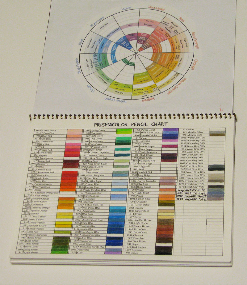
    I was taught to use colored pencils while in college. I can still hear Dr. B saying, “no tree is just one shade of green, you must layer colors, don't give me coloring book pages.” I don't have a lot of drawing talent. I can draw, but it's nothing special and I really don't love it, so rubber stamp art suits me well.

    Coloring rubber stamps presents some challenges, like size and the fact that the image is already drawn and stamped in one color. A popular approach among stampers is to use Gamsol to pull color from one part of the image to other, leaving some white to serve as the light source. This kind of contradicts what I was taught, because there is little or no layering of colors. I continue to struggle with applying a light source in a stamped image, and try to learn new things that help me improve. I find it hard to leave a bit of white for the highlight when I'm layering multiple colors in the small space that a stamp image provides. I watched three colored pencil videos this weekend. They each have a slightly different approach. 

    One uses a bit of pencil, no layering of colors which allows for a lot of white for the light source. Inky Antics
    The next one uses a couple colors, a bit more pencil on the paper, which still allows for a bit of white for the light source. Gina K
    The last one uses multiple pencil colors layering them for vibrant colors.. Instead of leaving white for the light source, the lightest color in the layers is the light source. Hero Arts

    The last one is more like what I do, and what I admire in other people's work. I really like the vibrancy and depth that layering colors provides. I now know that I can't leave white paper for the light. I'll continue to use a lighter shade, white, or subtractive color with an eraser.

    So, now I'll focus on WHERE to put the highlights! I was discussing this with my friend Dina Kowal, and she shared her general rules on shading from her blog:

    Shaded areas:
    areas that appear to be further away or curving away
    areas that are lower
    areas that appear to be behind something else

    Highlighted areas:
    areas that appear to be closer or curving toward me
    areas that are higher
    areas that appear to be in front of something else


    The three images above are North Woods. An online friend and I exchanged images. Thanks Silvia!!

    Thursday, December 8, 2011

    My Studio Smells Like...

    Babies!

    No cute little smiles or messy diapers here.

    Dina Kowal, from Split Coast Stampers has converted me to the use of baby oil as a blending agent with Prismacolor Pencils. Aside from the fact that I LOVE the smell, it blends so beautifully - it ends up looking so un-pencil-like.  It almost looks as though you've used markers. I'm still experimenting with different techniques like a very light yellow or pink for additional highlights instead of white. I find that after applying several colors then blending with my stump and baby oil, that I can still go back and add more color highlights here and there.

    So far, I still prefer using a kleenex as a final burnishing/buffing tool. I tried baby wipes but they took away a lot of color and the paper got too wet.

    Tuesday, November 15, 2011

    New Prisma Colors Added to Charts

     I just spent tons of time last month organizing my notes, typing them, and devising a numerical chart and a color family chart with all the correct colors. This took hours cross referencing various lists because the people who made them, had errors. Then I  get an email from Prismacolor announcing that they just added 18 new colors! lol:) So... I redid my charts:
    Organized by color families (color wheel) to fill in with the pencils you have. It's a great help to use while using  your pencils.
    Color Family Chart  (updated 12/16/2011) all one page
    Numerical Order Chart page 1
    Numerical Order Chart page 2 
    Color Pencil Tutorials: 
    Part 1 (9/1/2011)
    Part 2 (9/19/2011)

    Wednesday, October 5, 2011

    Prismacolor Pencil charts

    Prisma Colored Pencil Chart -Color Families

    Numerical order page 1

    Numerical order page 2

    I've looked at several charts done by other artists and friends, and everyone of them has had a mistake: a couple colors left off, named incorrectly etc. I began with the color wheel chart from Prismacolor. It's done in a color wheel idea, but... they didn't leave enough space to color. This is very important, because you need to look at your chart as  you're working to see what colors look like. I made one list in numerical order a few years ago, to use as my inventory sheet.  The one put in color families/color wheel order is the one I use while I'm working. I hope these are helpful to you.

    I intended to write a bit about my knee replacement surgery, but I've been sitting up for quite a while and I've run out of gas.  I have to save energy for physical therapy this afternoon.

    Thursday, September 8, 2011

    New Stuff

    The mail lady brought a box from Dick Blick today!!  Inside were several new colors of Prismacolor pencils, and the Derwent blender and burnisher. I'd read somewhere that they were very good, so naturally I just had to try them.  I opened the box right away, sharpened all the pencils, filled in my color chart and started experimenting. I used two kinds of paper one smooth and one with more tooth.
    Initial impressions:
    • burnisher produces a softer look, I like it better
    • blender moves the waxy pencil color around a lot, actually sounds different when it comes in contact with the paper's surface  
    • blender gives a more scratchy, textured look
    • used in combination, not much different than the blender used alone
    • I like the burnisher a little better than the Prisma blender
     I'm not sure how much detail will show in the scan, but some results are shown below.
    Oh and colors!  I just love the new greens that I got. Kelp green 1090, green ochre 1091, kelly green 1096, and artichoke 1099. Artichoke is almost not a green, kind of like one of the greens in camouflage and I know I'll use it alot.  I also got blue lake, clay rose, grayed lavender, and chestnut. The rest were replacement colors.  This brings my total up to 95 colors. Do I plan to get all 132? No. I'm not into just "collecting." I buy what I think I'll use.  Have you seen all the colors of gray there are?  There are 19!  There's no way I'd use all of them.  I have about 6 grays, an assortment of cool  and warm.  That's enough, for me anyway. My wish list has about 10 colors on it, and that'll be enough for me.
    A trifold, using up scraps of Japanese paper.
    Not one of my favorites, too..symmetrical or lined upish.
     Nature Geisha.  The Japanese maple leaves are from trees in our yard, as is the ginkgo leaf. I made some paper out of recycled junk mail a while back, and I still have quite a stash of it.  This one has Japanese maple leaves embedded in the paper.

    This is an old optical lens I got from an optometrist who retired. (before you could buy them commercially). I dug out my stash the other day and went to work.  The tiger is colored with Radiant Pearls, glued to a piece of silk paper then glued to the lens.

    Monday, August 29, 2011

    Colored Pencil Techniques

    I love Prismacolor pencils.  I decided I needed to brush up on my technique, so I pulled books from the shelf, notes from files and began re-reading them. Being a former teacher, I of course took notes. This turned out to be a happy accident, as a friend of mine wanted some help with her new Prismacolors. Several years ago I found a color chart in order by numbers. I’ve used it just to keep track of what colors I had. A few days ago I came across a chart done in color families and I thought wow, what a great way to decide what colors to use on a project and what colors you want to put together.  In her book, Colored Pencil for the Serious Beginner, Bet Borgeson talks about how to actually USE the color wheel and has an illustration of the colors and how the progression of hue temperature changes from cool to warm... which is how you show more or less light.  Light bulb went on in my head! I really like this book, it’s written for regular people who are not experienced. 
    My tips and techniques notes can be found HERE
    My new color chart by color families:
    chart page two
    Great Article on Prismacolors 
    Good Video

    Saturday, August 27, 2011

    Polished Stone

    Polished stone technique with Tria alcohol inks, daisy done with Prismacolor pencils.
    Prismacolor pencils on the one pane.


    Experimenting with color, supposed to be split complimentary, but I don't like that yellow border. It kind of hurts...too jaring. I might like a calmer more subdued yellow better.